

&imwidth=800&imheight=600&format=webp&quality=medium "Planning to go out? Here's how you can check live air quality easily on Google Maps")
Soon after winter arrived in India, multiple cities across the country began experiencing poor air quality. Among the most affected regions remains the national capital, Delhi, which marks the worst-affected region of India. As per the aqi. in data, the Air Quality Index (AQI) in Delhi stood at 435 on Tuesday, around 9 AM.
Meanwhile, over rising concerns related to air pollution, several people resort to real-time air quality data before heading outside their homes. To support this, Google Maps has come up with a feature depicting real-time AQI of the areas across India, so that people can plan their everyday activities with greater caution.
The AQI can be checked on both its mobile app and desktop site, displaying pollution levels through an easy-to-read colour scale. The index runs from green, indicating good air quality, to dark red, marking dangerous conditions. This data helps users judge whether it’s safe to work out outdoors, modify travel plans or take protective steps like wearing a mask.
Google Maps displays air quality using an hourly updated Air Quality Index (AQI) scale ranging from 0 to 500, where lower numbers indicate cleaner air and higher values signal worsening pollution, categorised as Good (0–50, green), Satisfactory (51–100, yellow), Moderate (101–200, orange), Poor (201–300, red), Very Poor (301–400, purple) and Severe (401–500, maroon).
Step-by-step: How to check AQI on Google Maps
Update the app
Trending Stories
&imwidth=180&imheight=135&format=webp&quality=medium)
India’s naval priorities: Ex-Navy Chief calls for third aircraft carrier, more warships and submarines
&imwidth=180&imheight=135&format=webp&quality=medium)
Abhishek Sharma sets all-time record for most T20I sixes in a year
&imwidth=180&imheight=135&format=webp&quality=medium)
US midterms 2026: FBI investigates suspicious mailings containing 'unknown substance' sent to election offices
&imwidth=180&imheight=135&format=webp&quality=medium)
‘My president, I mean my husband’: Trump's new press secretary Katie Zacharia's first briefing goes off the rails in 14 minutes
&imwidth=180&imheight=135&format=webp&quality=medium)
Nine former FBI employees fired over investigation into Trump's classified records sue Kash Patel, DOJ over alleged unlawful dismissal
&imwidth=180&imheight=135&format=webp&quality=medium)
Russian woman and Bihar boy's love story goes viral after she reaches India to marry him
&im=FitAndFill=(700,400)&imwidth=180&imheight=135&format=webp&quality=medium)
World's 7 most innovative countries in 2026 REVEALED: Did India make the list? | In Pics
&imwidth=180&imheight=135&format=webp&quality=medium)
Majid Majidi's new film Midday Meal takes top prize at Asia's biggest film festival
&imwidth=180&imheight=135&format=webp&quality=medium)
Oregon school shooting: 16-year-old identified as suspect after at least four killed, including three children
&imwidth=180&imheight=135&format=webp&quality=medium)
Who is Abu Dhabi royal Mahrah Al Nahyan, found unconscious on London street with toddler after cocaine use
&imwidth=180&imheight=135&format=webp&quality=medium)
Trump's tariff strategy faces new test: India wants preferential access and tariff stability
&im=FitAndFill=(700,400)&imwidth=180&imheight=135&format=webp&quality=medium)
Inside Tesla's Roadster: 10 features of Elon Musk's 'flying car' that push the limits of electric vehicles | In Pics
&imwidth=180&imheight=135&format=webp&quality=medium)
'Ukraine must get all it needs to protect civilians and infrastructure': Macron
&imwidth=180&imheight=135&format=webp&quality=medium)
Ukraine blinded: Musk deflects blame on Trump, Putin sharpens attack | Gravitas
&imwidth=180&imheight=135&format=webp&quality=medium)
Portland stabbing: Multiple people reportedly stabbed hours after deadly Bend school shooting
&imwidth=180&imheight=135&format=webp&quality=medium)
Leave India notice to Imran Khan explained: What are OCI rules and why can't foreigners protest in India?
&imwidth=180&imheight=135&format=webp&quality=medium)
Trump says Zelensky 'not a good guy' amid fresh Russia-Ukraine tensions | Watch video
&imwidth=180&imheight=135&format=webp&quality=medium)
US sanctions Cuban state-owned bank BICSA over alleged financial links to Iran
&imwidth=180&imheight=135&format=webp&quality=medium)
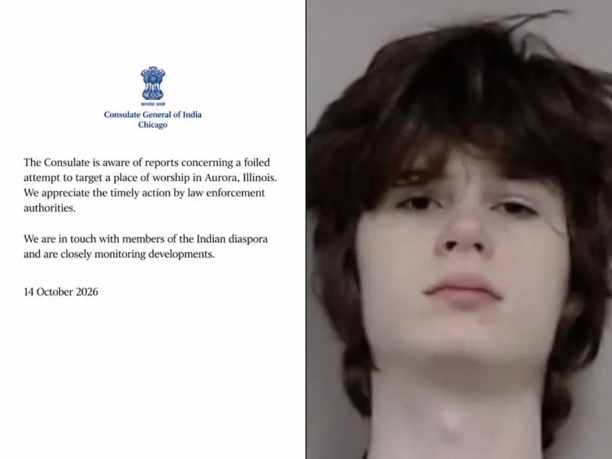
'Troubling pattern of threats': Hindu groups issue advisory after man arrested for alleged plot to target Illinois temple
&imwidth=180&imheight=135&format=webp&quality=medium)
Arijit Singh 9-city India stadium tour to start from January: Check venue and ticket prices
&imwidth=180&imheight=135&format=webp&quality=medium)
Broke Your iPhone Duo? Here’s how much screen repair could cost
&imwidth=180&imheight=135&format=webp&quality=medium)
'Turn approver, resign, we'll forgive you': Rahul Gandhi claims receiving messages from CEC Gyanesh Kumar
&imwidth=180&imheight=135&format=webp&quality=medium)
'White supremacist' terror plot against Illinois Hindu temple foiled by jammed gun: Who is Alexandros Paporakis?
&imwidth=180&imheight=135&format=webp&quality=medium)
Central Park in Delhi shut on October 16, 17 amid CJP's protest call
&imwidth=180&imheight=135&format=webp&quality=medium)
Turkey Floods: Heavy rains flood homes and submerge vehicles in Istanbul
&imwidth=180&imheight=135&format=webp&quality=medium)
Australian woman charged for adding snail poison to lover's curry at work
&imwidth=180&imheight=135&format=webp&quality=medium)
Saudi Arabia executes Two Bangladesh nationals over immoral act
&imwidth=180&imheight=135&format=webp&quality=medium)
Girl 'dead' for 8 hours wakes up at her own funeral, dad insists she wasn't breathing
&imwidth=180&imheight=135&format=webp&quality=medium)
'Will stand with Pakistan in case of war with US': Rajasthan BJP chief's remark sparks row
&imwidth=180&imheight=135&format=webp&quality=medium)
Mumbai: CJP brings Tricolour protest to Azad Maidan after weeks of demonstrations
&imwidth=180&imheight=135&format=webp&quality=medium)
Netanyahu defies Trump, blocks Gaza military base for Board of Peace | Gravitas
&imwidth=180&imheight=135&format=webp&quality=medium)
US-Iran War: Trump eyes mother of all bombs; Iran in crosshairs
&imwidth=180&imheight=135&format=webp&quality=medium)
Russia-Ukraine War: Putin vows retaliation against Ukraine
&imwidth=180&imheight=135&format=webp&quality=medium)
Earthquake measuring 7 magnitude strikes Russia’s Kamchatka Peninsula
&imwidth=180&imheight=135&format=webp&quality=medium)
'Turns out the future does have flying cars': Musk's Tesla unveils 'flying' sports car with SpaceX technology | Watch
&imwidth=180&imheight=135&format=webp&quality=medium)
Was Trump in danger at Alaska rally? Viral video shows Secret Service agents reacting
&imwidth=180&imheight=135&format=webp&quality=medium)
Katie Zacharia, White House Press Secretary admits she never passed bar exam amid credentials controversy
&im=FitAndFill=(700,400)&imwidth=180&imheight=135&format=webp&quality=medium)
Inside the Peshawar school tragedy: 34 dead, building's condition under scrutiny and owner arrested. Here's what all happened
- Open the App Store (iOS) or Google Play Store (Android).
- Search for Google Maps and install any available updates.
Open Google Maps
- Launch the Google Maps app on your phone or tablet.
Tip: If you use Maps on desktop, open maps.google.com in your browser — the steps are similar.
Search for a location
- Tap the search bar at the top and type a city, neighbourhood, landmark or an exact address.
- Alternatively, pinch-to-zoom or double-tap to zoom in on the map to see air quality near your current position.
Open the layers menu
- Look for the layers icon next to the search box; it looks like a small stack of squares (often bottom-right on desktop and top-right or top-left on mobile).
- Tap that icon to open layer options (traffic, public transport, satellite, etc.).
Select “Air Quality”
- In the layers list, choose Air Quality.
- The map will immediately overlay a colour-coded AQI layer showing pollution levels where you’re looking.
Read the colour-coded scale
- The map uses a colour scale (green → yellow → orange → red → dark red) to show air quality from good to hazardous.
- Tap a coloured area or the AQI icon on the map for a numeric AQI value and any additional details (e.g. pollutant levels).