Putting 3D on 2D surface - Why is Africa's true size not shown on the world map?

&imwidth=600&imheight=450&format=webp&quality=medium "Putting 3D on 2D surface - Why is Africa's true size not shown on the world map?")
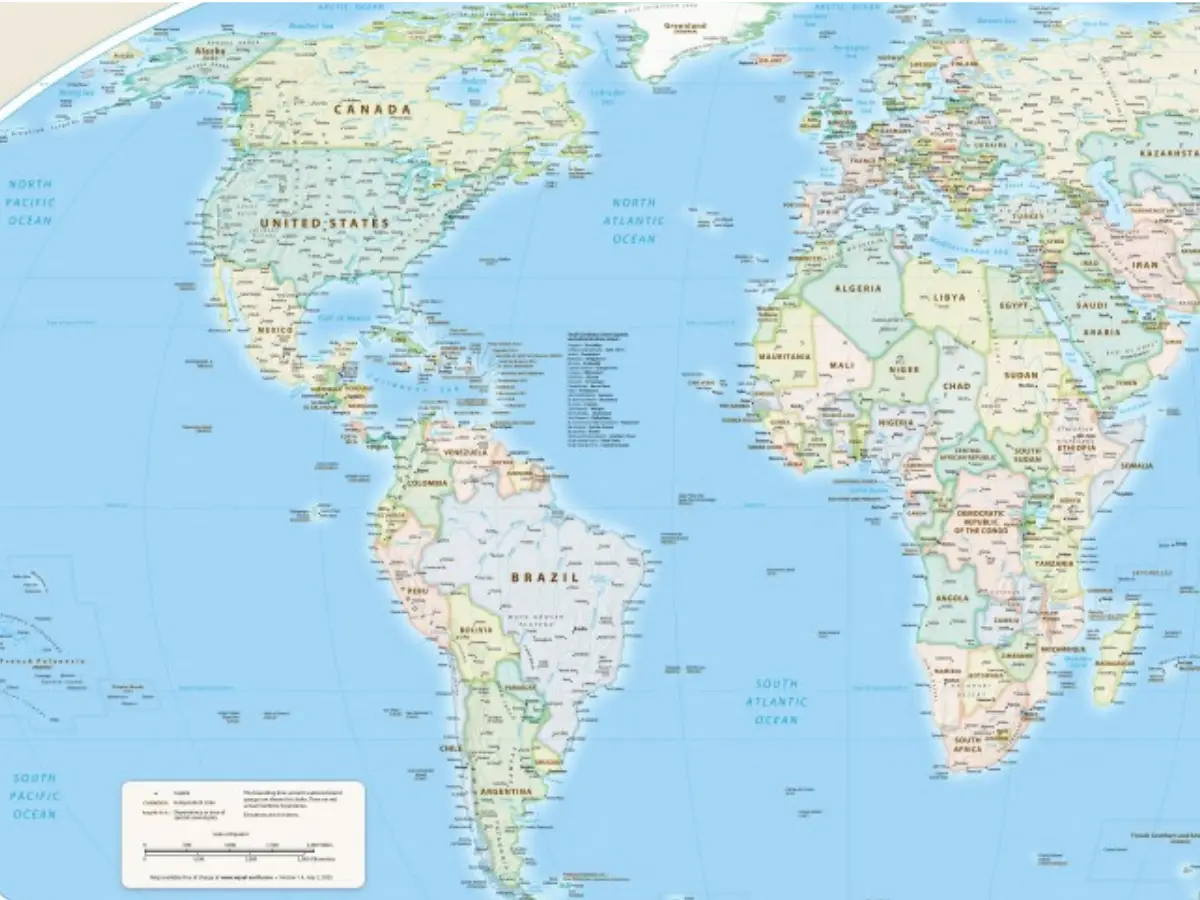
This handout graphic provided by Equal Earth shows the Equal Earth cartographic projection. Photograph: (AFP)
Why hasn't Africa been shown in its true size on the world map till now? It is 14 times larger than Greenland, yet it looks the same as the island, even though the latter is extremely small. This is because the maker of this over 450-year-old map chose to prioritise the West.
In a bid to create a "fair world" with a "fair map", the United Nations voted for a world map to reflect the true size of Africa. While on the current map it appears similar to Greenland, the continent is actually 14 times larger than the island. Its size means that it can fit "the United States, China, India, Japan, Mexico and much of Europe" with land to spare, according to online campaign group #CorrectTheMap. Africa can also comfortably fit three Canadas.
The Mercator map has been in use since the 16th century and over generations has created the perception that Africa isn't very large. Critics say this has pushed the countries near the equator to the background when it comes to development needs and the potential they hold. Countries like America are projected as bigger and more important.
But as we now know, Africa is way bigger than the map shows. So why does the map not show the true size of Africa? This is because of the party whose interests this map was made to serve.
Why does Africa appear smaller on maps?
The Mercator map was designed in 1569 by the Flemish cartographer Gerardus Mercator. It was meant to help European explorers navigate across the world. Meridians and parallels were drawn as straight lines that cross at right angles to navigate treacherous voyages. Charting the surface of a globe on a two-dimensional chart accurately was tricky. Mercator stretched out the northern and southern extremities of the globe to fill the gaps near the poles left when the equator was used as the centre of the map.
Trending Stories
&imwidth=280&imheight=210&format=webp&quality=medium)
&imwidth=280&imheight=210&format=webp&quality=medium)
&imwidth=280&imheight=210&format=webp&quality=medium)
&im=FitAndFill=(700,400)&imwidth=280&imheight=210&format=webp&quality=medium)
&imwidth=280&imheight=210&format=webp&quality=medium)
&imwidth=280&imheight=210&format=webp&quality=medium)
&imwidth=280&imheight=210&format=webp&quality=medium)
&imwidth=280&imheight=210&format=webp&quality=medium)
&imwidth=280&imheight=210&format=webp&quality=medium)
&imwidth=280&imheight=210&format=webp&quality=medium)
&imwidth=280&imheight=210&format=webp&quality=medium)
&imwidth=280&imheight=210&format=webp&quality=medium)
&imwidth=280&imheight=210&format=webp&quality=medium)
&imwidth=280&imheight=210&format=webp&quality=medium)
&imwidth=280&imheight=210&format=webp&quality=medium)
&imwidth=280&imheight=210&format=webp&quality=medium)
&imwidth=280&imheight=210&format=webp&quality=medium)
&imwidth=280&imheight=210&format=webp&quality=medium)
&imwidth=280&imheight=210&format=webp&quality=medium)
&imwidth=280&imheight=210&format=webp&quality=medium)
&imwidth=280&imheight=210&format=webp&quality=medium)
&imwidth=280&imheight=210&format=webp&quality=medium)
&imwidth=280&imheight=210&format=webp&quality=medium)
&im=FitAndFill=(700,400)&imwidth=280&imheight=210&format=webp&quality=medium)
&imwidth=280&imheight=210&format=webp&quality=medium)
&imwidth=280&imheight=210&format=webp&quality=medium)
&imwidth=280&imheight=210&format=webp&quality=medium)
&imwidth=280&imheight=210&format=webp&quality=medium)
&im=FitAndFill=(700,400)&imwidth=280&imheight=210&format=webp&quality=medium)
&imwidth=280&imheight=210&format=webp&quality=medium)
&imwidth=280&imheight=210&format=webp&quality=medium)
&imwidth=280&imheight=210&format=webp&quality=medium)
&imwidth=280&imheight=210&format=webp&quality=medium)
&imwidth=280&imheight=210&format=webp&quality=medium)
&im=FitAndFill=(700,400)&imwidth=280&imheight=210&format=webp&quality=medium)
With this system, Western cartographers had more space to mark towns, cities, and roads in their part of the world. This led to the regions at the equator being pushed to the background. Whether the maps showed their true size or not didn't matter as much to the Westerners, even though Africa has just as much to be mapped.
So now, Canada, Russia, the United States and Europe all appear bigger than they are. Even Greenland, which is only about the size of the Democratic Republic of Congo, looks the same as Africa.
Mercator map linked to power dynamics
Critics say that this wrong visual representation of the size of countries and continents on the Mercator Map lends them an air of power and intimidation. "The term ‘power of representation and representation of power’ sums up quite well how maps and the rise of the Western nation-state system – and with that, empire and colonialism – are linked," Marianne Franklin, professor of Global Media and Politics at Goldsmiths, University of London, told CNN in 2018.
Equal Earth projection
This was an equal area map created by a team of cartographers in 2018 to represent the true size of all continents, especially Africa. It was adopted by the African Union's (AU) 54 member states in February, who stated that it "more accurately represents the sizes of all continents, particularly Africa".
Several groups have been campaigning to end the use of the Mercator Map. They say that its adoption is a deliberate attempt to create misinformation about Africa. Kenyan geographer Kioko Muendo told BBC that the Mercator map has downplayed the African continent's vast resources, population and investment opportunities.
Even though the UN vote is non-binding, it will lead to most institutions in the world shifting to an equal world map.