Nokia ditches iconic blue logo in an attempt to change brand identity


Nokia logo
Nokia, Finnish multinational telecommunications, floated plans on Sunday to rebrand itself for the first time in 60 years. The telecom released a new logo focused on aggressive growth in this competitive market.
The company dropped its old and iconic blue-coloured logo and introduced two brand new logos comprising five different shapes forming the word NOKIA. In the new logo, there is a range of colours for usage.
In an interview with news agency Reuters, Chief Executive Pekka Lundmark said: "There was the association to smartphones and nowadays we are a business technology company."

The logo, which appears to be part of a new corporate strategy was announced a day before the annual Mobile World Congress (MWC2023), in which the company will unveil the business update. The annual event opens in Barcelona on Monday and runs until March 2.
Lundmark has set out a strategy with three stages: reset, accelerate and scale; the second stage is beginning, with the reset stage now complete.
Lundmark took over the top job at the struggling Finnish company in 2020.
&im=FitAndFill=(700,400))
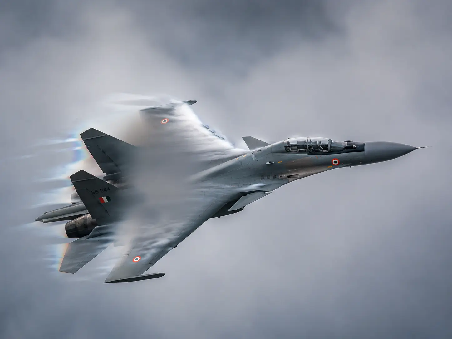
How fast can the Sukhoi Su-30 fighter jet really fly?
)
Did China ask its people 'not to respond to aliens'? Origin of bizarre claim on social media
)
MS Dhoni-CSK Fallout? Report claims failed stake sale talks triggered rift
)
Scientists reveal the SAFEST COUNTRY when catastrophe strikes the planet
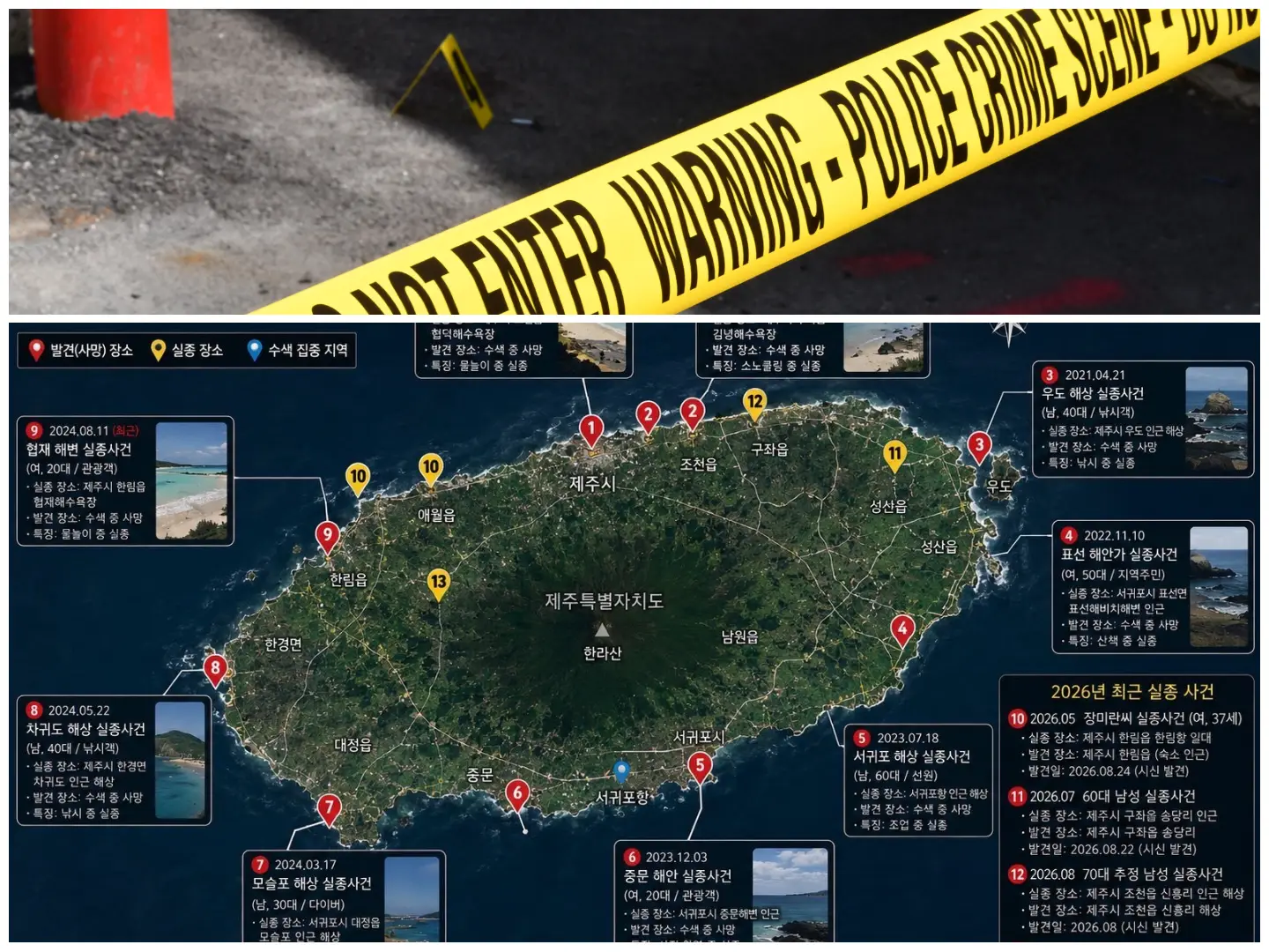)
Serial killer on the loose in South Korea's Jeju Island? Fourth body found in three days as more than a dozen people go missing
)
2/3rd of glacier detached, collapsed: ISRO satellite images reveal what triggered Nepal floods
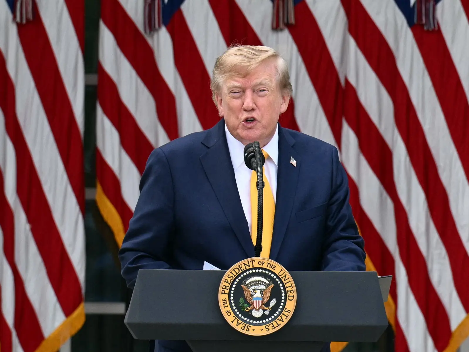)
Trump once again claims without him there would be ‘no Israel right now’
)
Foreign espionage attacks against German companies surge to 37%, Bitkom report reveals
)
Blake Lively wins partial legal fee from Justin Baldoni after $8M request
)
Why is Pakistan deploying Turkish Bayraktar TB2 drones near India border?
)
'OH MY GOD! We've found other agents!': Investigators discover not one or two, almost 700 OpenAI AI agents went rogue, hacked Hugging Face
)
Lunar eclipse 2026: India timings, places to see and more. August Blood moon factsheet
)
RSS chief Mohan Bhagwat on global outreach tour
)
Both pilots killed as training aircraft crashes in Lucknow – What we know
)
16-year-old charged with preparing terror attack on kindergarten in Norway
&im=FitAndFill=(700,400))
How the S-400 protects itself from enemy attacks
)
Nepal floods: Over 165 dead, 400 missing; US, India, China, World Bank mobilise aid
)
India's multi-layered watch: The new surveillance war
)
5 doomsday planes spotted in US skies hours after CIA director's secret trip to Russia
)
9/11 mastermind Khalid Sheikh Mohammed to finally face trial in 2028, nearly 27 years after horrific attacks
)
Islamabad hospital fire: What we know about one of the biggest facility that housed Imran Khan
)
Workers run for life while filming Nepal flash flood: Scary new visuals emerge from Rasuwa
)
Russian military planes enter South Korean air defence zone amid rising tensions with North Korea: What's happening
)
Ron Weasley Is Back! Rupert Grint set to return to Harry Potter universe on Broadway
)
400-year-old 'vampire' grave in Poland reveals non-existent genetic lineage
)
Dolly Parton, global icon and queen of country music, dies at 80
)
Nepal flash floods: Kailash Mansarovar yatra affected, close to 400 pilgrims out of contact
)
'If he is dead, they're putting on a pretty good show': Trump casts fresh doubt over Mojtaba Khamenei's fate
)
Man arrested near US Capitol with guillotine in pickup truck: What happened?
&im=FitAndFill=(700,400))
Why the Su-30MKI cockpit is painted bright turquoise green
Lundmark said: "We had very good 21% growth last year in enterprise, which is currently about 8% of our sales, (or) 2 billion euros ($2.11 billion) roughly. We want to take that to double digits as quickly as possible."
WATCH WION LIVE HERE
You can now write for wionews.com and be a part of the community. Share your stories and opinions with us here.